

Gregor’s Lecture THREE Notes
Design One: ‘The Autumn says Goodbye’


This was the most ‘fulfilling Autumn’ in my professional Life. So rich, so intense, so much staying on track daily. I am ready now… with a bit of wistful feeling … to say farewell to the warmth of color that filled me through this season. The warm days, with cooler nights bring golden change of light… a soft layer of melancholy that is felt as dark grey winterly face appears. This is the place, the emotion where my work concept is born.
WOOD is again ever present as the main element of inspiration for our class… the outgoing color explosion is not the only message however, the contrast plus harmonies are the driving force of the emotional expression of the rich season.
About Contrast
Color contrasts, active and passive comparisons to provide the rich visual experience.
Contrast of wood and herbaceous, the busy and calm story.
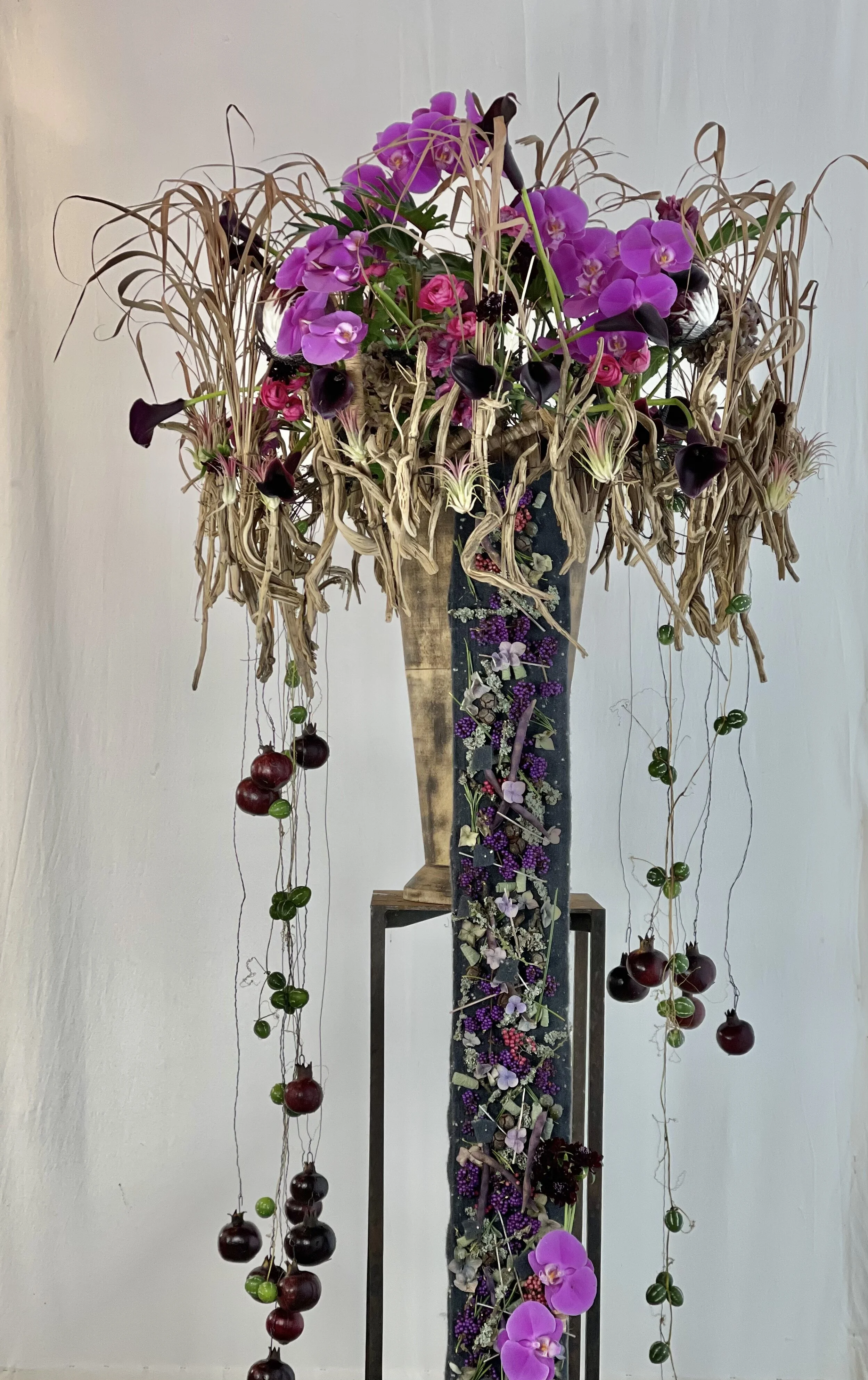
Construction
Stand – design is displayed on an black iron, modern rustic stand so that the hanging part is very well displayed well above the floor at eye level for closer look at the flowers… The design can be spotlighted from underneath – a very good way to present this work.
Base - base for this design is a very strong but thin wooden vase. It was black originally but was sandpapered to get a more rustic look. Along the rim of this vase, I drilled a row of many small holes, and wired through each hole with 1.8mm stubwire. The longer wires hold varied sized Rosemary (wood pieces) which create a collar of parallel downward flow/movement.
Water tubes – Up close to the rim of the vase are many wrapped water tubes (crosswise first) to use for plant materials and flowers. Some are flat to the rim and others upright directed for stems of flowers which should stand more actively upwards. See the closeup photo attached.
Hanging ornaments - 2 to 3 groups of black Pomegranates (Punica granata) hang on brown wax strings , straight down to express a bit of sadness, dark elegance that conveys the season’s end.
Botanical tapestry - the very interesting part of this work is the Felt ribbon, double glued together back to back over Bronzenet wire grid (Oasis Wiremesh). This form also hang straight down draped onto the floor. On this ribbon, variety of many small botaicals, mostly in black, brown and pink are attached.
The Botanicals
Botanical tapestry
Pepperberry (Schinus molle)
Black Reed sticks
Ligustrum berries (black) – hard to find this year
Brown wooden sticks
Pink Snowberry (Symphoricarpus roseum)
Hydrangea (single blossoms in pink and soft green
Very small parts of Fibers
At the bottom of the tapestry is a collection of small group of flowers which coordinate with those on the main design above – in the focal emphasis area.
Design at the rim of the wood vase (Focal zone)
Purple mini-callas (Zantedeschia)
Black mini-callas
Pink smaller Phalaenopsis
Schinus molle
Scabiosa atropurpurea ‘Black Scoop’
Ligustrum berries (black)
Smaller Tillandsias
Tillandsia usneoides
DESIGN ORDER: Asymmetrical in a weaker grading (intensity from 1 to 10)
DESIGN STYLE: Decorative
LINE ORDER: Parallel
DIRECTION & PROPORTION: Downward directed
Sketches
(click to enlarge)
Design Two: ‘Janus Christmas Tree’


I found it appropriate at this time to create a Winterwork to be Christmassy. Under the Wood Talks inspiration, to create a pure, natural and original botanical design - with highly organic textural surfaces, with no commercial kitsch.
The piece will be a Christmas tree, an asymmetrical one with idea of various contrasts.
In ancient Roman religion and myth, JANUS is the god of beginnings, gates, transitions, time, duality, doorways, passages, frames and endings. He is usually depicted as having two faces – he looks to the future and to the past. It is conventionally thought that the month of January is named for JANUS.
We know the Janus head with the 2 faces, from history and figure of significance in Art. Our times are so controversial, the world is experiencing contrast of situations. Lets express a work which is full of symbolism, with deep Roots, also showing ‘light green and fruit’. The 2 faces are not between good and bad, they are between various contrasts – a theme hopefully in between us, to create tensions and expression of feeling. It can even be very much full of symbolic signs and impacts.
Construction
The left side of the Christmas tree is tectonical, more static, constructed, built, cool, naked.
Functional to hold the candles like server’s hands. These wood hands are held by hammered wire, which is drilled onto the wooden post. The distance in between these hands and their size are based on asymmetry.
The other side is purely wintery, natural interpretation. It has no static rigidness, no right angles, only the free internal and external orders of twigs and smaller branches. This side is a little bigger and fuller as a consequence for asymmetry, airiness and transparency on the other side. Sensation of stark contrast, of Tight and Loose. The branches are mostly thinner as a finger, and they are wired and overlapping to build a stable structure – still following the silhouette of a Christmas tree.
Base – heavy iron square vase, full of stone for weight.
Water tubes – on wire arm and hook
Botanicals & Supplies
Medium sized red apples dipped in wax to make them last very long time.
Crab apples on smaller twigs dipped in wax
Red Ranunculus
Muelenbeckia vine
Hedera helix – reddish wintery vine (Ivy)
Bundled packages of Pine Needles – to bring calm and green
Few wooden spheres – example of processed wood
Effect
I thought of a Christmas Tree for a modern family with children, who has an eye for design in a contemporary space. For someone who can appreciate wood works with various forms filled with symbolism – it is not just decorative…
Sketches
(click to enlarge)